Package Redesign and Development of New Package Guidelines.
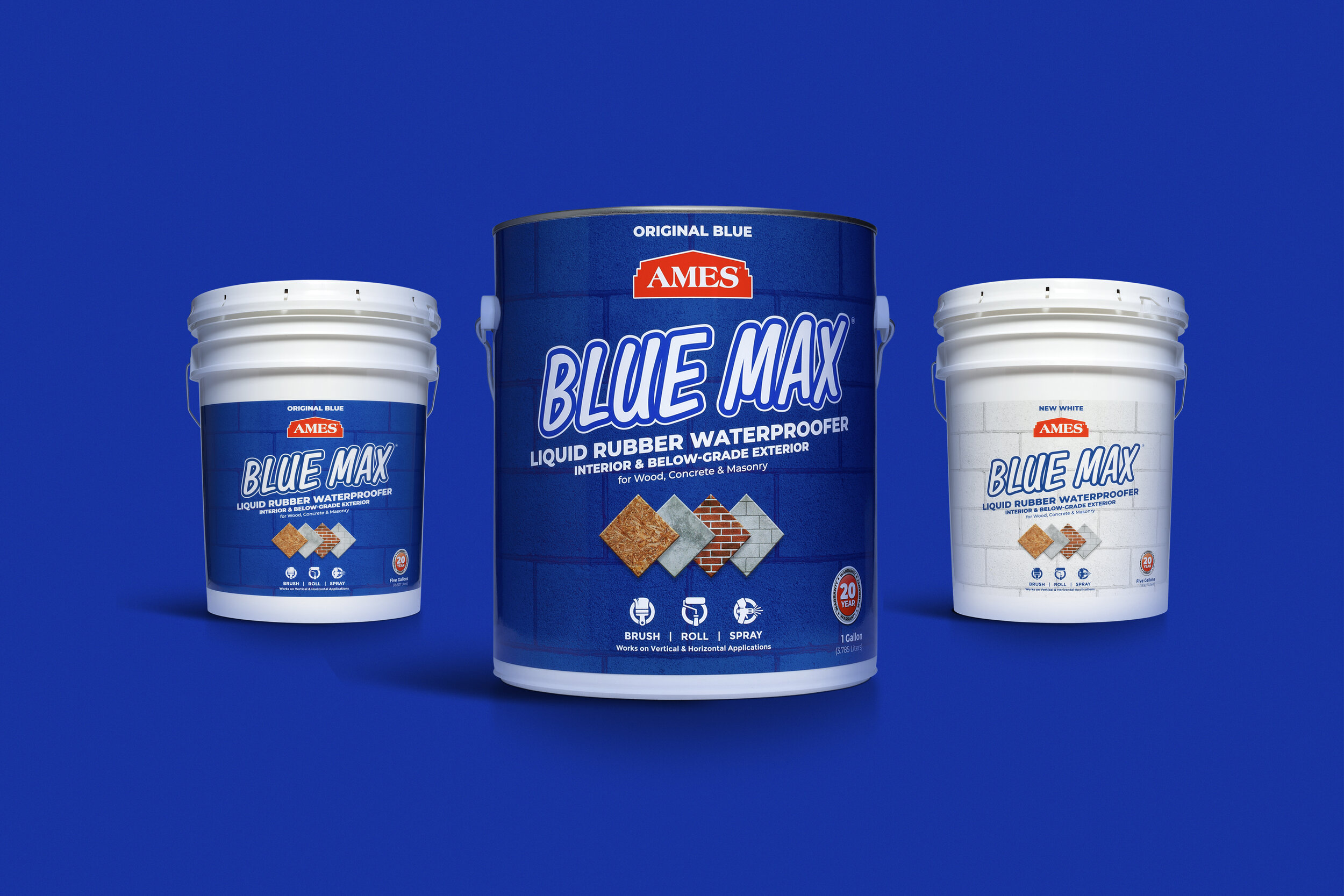
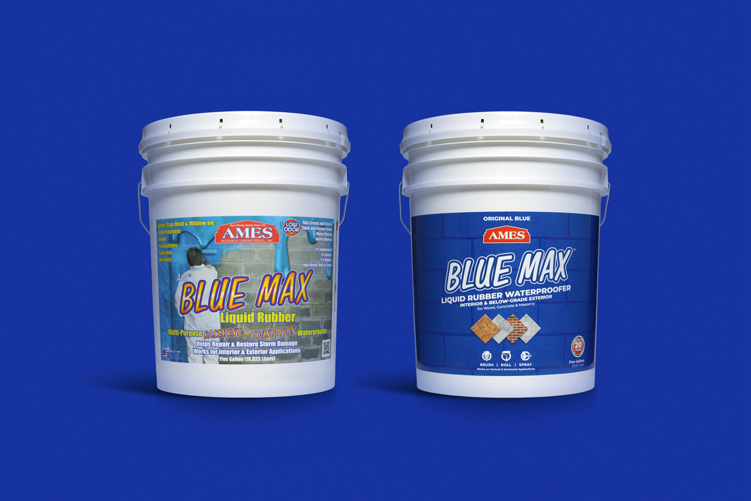
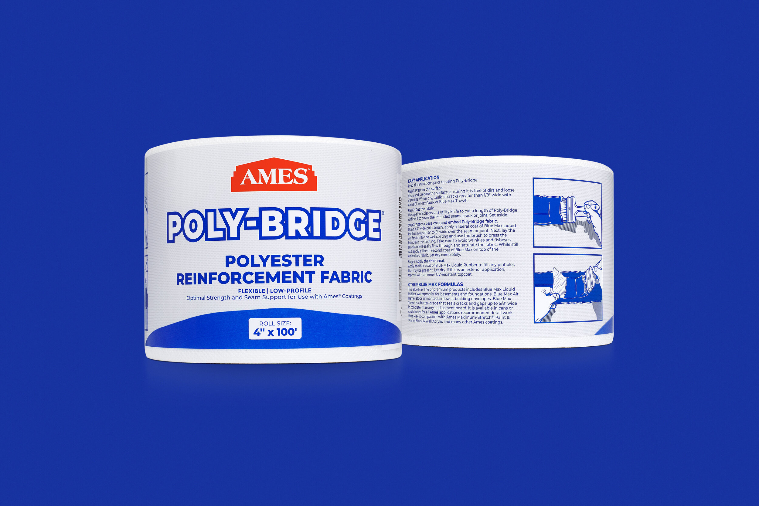
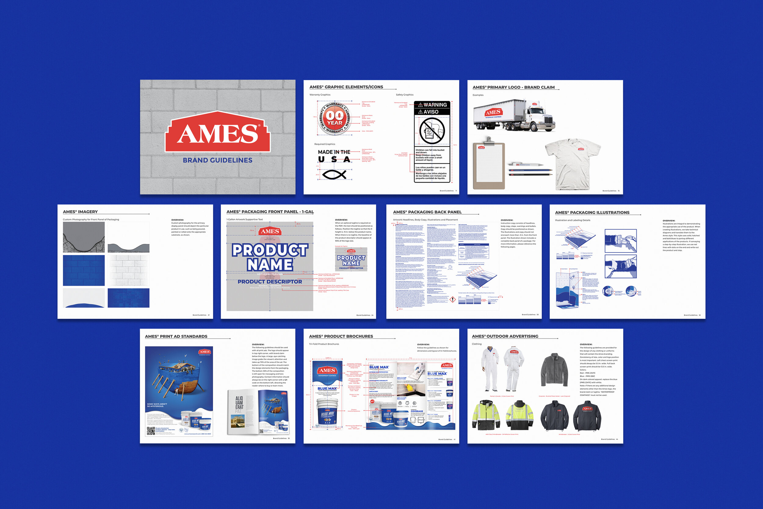
Ames' product packaging had become outdated, lacking the sophistication and flexibility needed to represent their expanding and modern product line. However, Ames was cautious about deviating too much from their already recognizable logo among professional contractors. Starting with their top-selling brand, Blue Max, I reviewed the hierarchy, graphic elements, and photography to enhance the product's packaging. Ames was pleased with my approach, and after successfully launching the first product in stores, I began rebranding the rest of their line, establishing brand standards and guidelines for their packaging and photography. To date, I have redesigned over 10 different SKUs.
